

ogo motion: the winner of our ugliest logo contest gets a new look
 AT A TIME when makeover shows are all the rage, we got in the spirit and held Entrepreneur's Ugliest Logo Contest (Powered by LogoWorks) to help businesses spruce up their image. Logo-design firm LogoWorks gave grandprize winner J.A. Cunningham Equipment Inc. a logo makeover, plus $2,500 worth of promotional products, and template designs for a brochure, a Yellow Pages ad and a PowerPoint presentation. Clete Cunningham, J.A. Cunningham Equipment's vice president, says the Philadelphia-based, family-owned welding supplies and equipment business has been around for 60 years--and so has its logo. It was time for an update.
Customers have often misinterpreted what J.A. Cunningham's original, hand-drawn logo represents. An electrode holder using a stick-welding process may have been a commonplace image when the business started, but it now represents old technology. The logo also fails to indicate that the company manufactures and distributes welding supplies and equipment. Cunningham hoped for a new logo that would provide a better visual representation of the business and replace the antiquated look he worried made them appear slow or conservative.
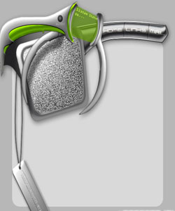
Enter LogoWorks, whose logo-design process delivers several concepts for customers to choose from within 72 business hours, at an affordable price (packages range from $265 to $549). Morgan Lynch, founder and president of LogoWorks, says J.A. Cunningham's new logo conveys a modern company--"it's more abstract." The sunburst behind the tanks emits a positive image, while the use of gradients on the welding adds depth and dimension. (Lynch notes Apple Computer uses gradients frequently, since they exude a "very high-tech feel.") Putting the company name right on the logo should also dispel questions about what J.A. Cunningham does.
Of the many ideas LogoWorks sent to Cunningham, this one speaks volumes. "It's a much more powerful, almost stylized view of what we're all about," says Cunningham. "The logo adds some color and punch and portrays us as a modern, more aggressive supplier." He hopes to not only use the logo on letterheads, business cards and apparel, but also make it a focal point of his company's advertising. "This is going to be a great opportunity for us to reconnect with some old customers and strengthen our ties with current ones."
If you don't think logos are integral to building a brand, think again. "When small businesses, especially in the service industries, are not nationally established brands, the first thing your customers are going to go off of is the look and feel of your logo," explains Lynch. "Your logo should reflect your company and its personality in a professional and credible manner."
Cunningham never thought his company would win the contest. "If you put together all the attempts I had made to redesign the logo throughout the years--on the backs of envelopes, inside Milky Way wrappers and on cocktail napkins--it would be an inch thick. We were really amazed."
© Copyright 2026 Cotlerdesign.com All rights reserved. |